Consulting is a fact-based business as consultants must derive insights from these facts. The most effective and efficient way to convey crucial information is through charts and exhibits. Thus, the ability to interpret charts and tables is an essential skill sought after by interviewers.
In fact, 90% of consulting case interviews involve interpreting charts and data, and this requirement is non-negotiable for top-tier firms (MBB). This article will introduce you to six different types of charts that commonly appear in consulting case interviews.
Table of Contents
Why do consulting firms use charts in case interviews?
Charts play a crucial role in consulting. They make communication clear, aid in data analysis, and help in decision-making. Likewise, they improve the overall consulting experience, promote collaboration, and increase the value that consultants offer to their clients' businesses.
In the consulting recruitment process, interpreting charts in case interviews is vital because interpreting charts, tables, graphs, and other exhibits is a fundamental skill for a consultant.
Charts serve as powerful communication tools, conveying a wealth of information quickly without the need for extensive verbal explanations. These methods contain both quantitative and qualitative data, which candidates must utilize to solve, or at least address, the case at hand effectively.
Additionally, charts enable interviewers to assess a candidate's capacity to absorb and distill vast amounts of information into valuable insights relevant to the case. They provide a means for evaluating a candidate's resourcefulness, situational awareness, adaptability, and problem-solving abilities, all based on the information presented within the chart.
Six groups of charts in case interview
One thing you should be aware of is that there are many variations of chart types that you may encounter in consulting case interviews. You must learn the fundamentals of chart interpretation skills instead of just learning certain types of charts.
Below are some common types and I will divide them into six different groups
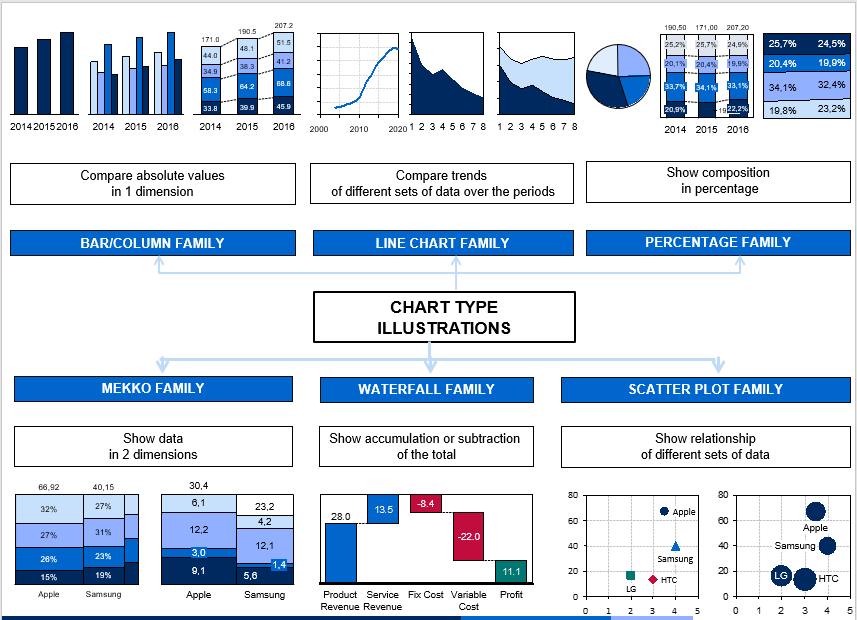
Bar/column chart group
The Bar/Column charts group show data using rectangular bars/columns where the length of the bar/column is proportional to the data value.
Bar/Column chart is best used to compare absolute values across a few categories. It displays discrete data, which consists of whole numbers that are counted rather than measured.
Simple bar/column chart
Bar or column charts serve as a straightforward and efficient means of comparing standardized and quantitative values. They are particularly useful when you need to compare values for several items at a specific moment in time or for 1-2 items across different time intervals.
However, it's essential to keep in mind that if you have an excessive number of items or time intervals, the chart's clarity and ease of interpretation may be compromised, and alternative visualization methods may be more suitable.


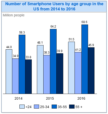
Clustered bar/column chart
A clustered bar/column chart is a variation of the traditional bar/column chart where multiple bars or columns are grouped together to visualize various sets of data across the same categories.
This chart is helpful when you need to make direct comparisons between different components within each category, such as comparing the revenue of two products over three years.
However, it's important to note that while it's effective for within-category comparisons, it can be less suitable for comparing total values across different categories due to the clustering of data, which may make such comparisons more challenging.
Stacked bar/column chart
A stacked bar/column chart is another variation of bar charts that you might encounter in case interviews. It takes the standard bar chart and adds one or more categorical variables to it.
Stacked bar charts are helpful when you need to compare not only the total sums but also the individual components of a whole, allowing you to see how these components change over time or across categories.
In addition, they are also useful for analyzing parts of a whole and their variations.

Line chart group
The line chart is represented by a series of data points connected with a line. Line chart group is a powerful and simple visual tool that shows how values change over time.
This type of chart were usually use to show trends and compare multiple continuous data points. Another application is to make predictions, a line chart can be extrapolated beyond the data at hand. It enables you to make predictions about the results of data.
Simple line chart
A line chart is a simple and efficient way to represent time-series data, showcasing the progression and trends in data over a specific timeframe.
Unlike bar charts, they are space-efficient because they link time points with lines, enabling the visualization of numerous time intervals without clutter.
Line charts excel at displaying how one or more values change continuously over time, allowing you to spot patterns, trends like seasonal fluctuations, significant shifts, or turning points.
Thus, they can be used for predictive purposes, making them a valuable tool for analyzing and understanding time-dependent information.

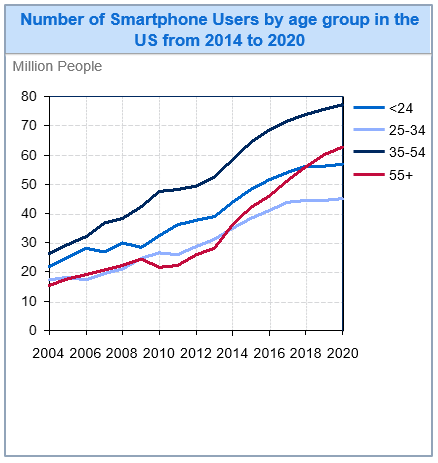
Multiple line chart
A multiple line chart is a powerful tool for comparing different sets of data. It retains all the attributes of a simple line chart, making it effective for showcasing the trends within each dataset and allowing for in-depth analysis and comparison of these trends.
This type of chart is particularly valuable when you want to visualize and understand how multiple variables or categories evolve over time, helping you draw meaningful insights and make informed decisions based on the trends you observe.
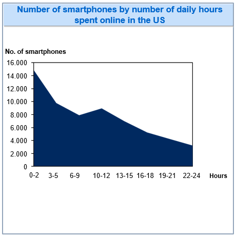
Arena chart
Area chart is a special version of line chart, which is filled in with color or shading between the x-axis and the line to make areas.
An area chart is used when you want to show the trends over time and especially useful when the product of the quantities on x-axis and y-axis (the third quantity) has a significant meaning.
Multiple area chart
A multiple area chart is akin to an area chart, but it excels in highlighting the origins of disparities among totals.
This chart is particularly valuable when your aim is to compare the third variable, which is essentially the result of multiplying the quantities on the x-axis and y-axis, across various categories.
It provides a visual representation that elucidates the sources of these differences, making it an excellent tool for understanding complex relationships and variances within data.

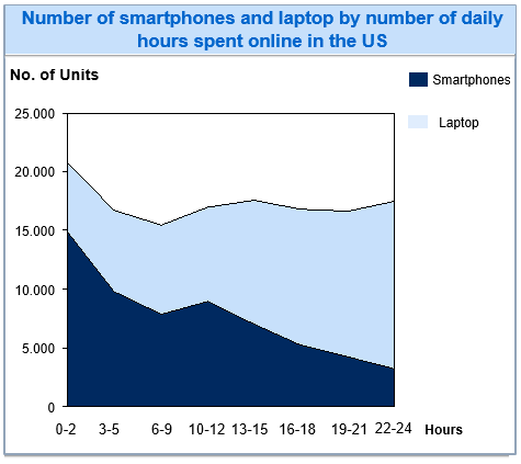
Stacked area chart
A stacked area chart is a variation of area charts where the values of different categories are layered on top of each other. It is often employed to illustrate the cumulative sum of values across categories rather than individual values, allowing for comparisons between multiple variables.
This chart serves two primary purposes: firstly, it facilitates a part-to-whole analysis, making it easy to see how each category contributes to the whole.
Secondly, it enables a straightforward comparison of the trends or proportions of different categories, aiding in the interpretation of complex data relationships.
Percentage chart group
The percentage chart group includes charts with different shapes but serves the same purpose: presents partial numbers as percentages instead of as absolute values. This type of chart shows the contribution of a part to the whole quickly and directly.
Pie chart
Pie charts are excellent tools for visualizing proportions. They effectively display the parts that make up a whole without any overlap in their segments. However, this type of chart cannot represent data over time.
These charts are most useful for emphasizing the share of a total and compare how different components contribute as percentages to the overall whole.
In addition, in some cases, chart makers may provide the total absolute value for easy calculations alongside the chart.

Stacked bar/column 100% chart
The 100% bar chart is a variation of the bar chart. It's basically a stacked bar chart that illustrates the relative percentage of multiple data series in stacked bars, where each full bar always represents 100%.
It is important to note that although all bars have the same height visually, their totals can differ.
This type of chart is best used to achieve two main objectives:
- Firstly, to demonstrate how the proportion of each component changes over a period.
- Secondly, to compare percentages across different sums, such as across multiple categories or over various years.

100% stacked area chart
A 100% stacked area chart is a variation of the stacked area chart, where the cumulative total of each stacked area always equals 100%.
This chart is particularly useful for illustrating how the components of a whole have continuously changed over multiple time periods. It provides a clear visual representation of how different elements contribute to the entirety tracking period.

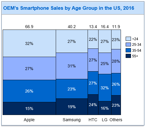
Mekko chart group
A Mekko chart is a 2-D stacked chart, with varying column heights and varying column widths. Note that there are no gaps between columns in a Mekko chart.
When you want to depict an added dimension of the data through varying column widths and the product of quantities on x-axis and y-axis has a meaning.
Mekko chart with absolute value
A Mekko chart with absolute value is a graphical representation that presents data using varying column heights and varying column widths to depict two dimensions of each category in absolute numerical values.
The column heights represent one dimension, while the variable column widths represent another, allowing viewers to visually compare and analyze the absolute values of different categories along these two dimensions.

Mekko chart with percentage axis
A Mekko chart with a percentage axis closely resembles a 100% column chart but distinguishes itself by utilizing variable column widths along the x-axis to visually represent absolute column totals.
This chart effectively conveys the relationship between different data categories in terms of percentages while also providing insight into the absolute values through the varying column widths.
It offers a comprehensive view of both relative proportions and absolute quantities within each category.
Scatter plot chart group
Scatter plot group uses dots to represent individual pieces of data on an X-Y coordinate, as opposed to a line chart that uses a line to plot a continuous function. Thus, to plot individual pieces of data without trends as opposed to line graphs and to show the relationship/correlation between two or more variables.
Scatter plot chart
Scatter plots charts are a versatile tool for visualizing the relationship between two variables. They work by plotting data points on a grid, allowing us to see correlations effectively.
Scatter plots can handle a large amount of data points while maintaining clarity. They are best used when you need to understand how two variables relate in a two-dimensional space and make quick comparisons across different categories or entities.
However, they are limited to displaying data in two dimensions due to the use of only two axes.

Bubble chart
A bubble chart is a variation of scatter plot that adds a third dimension by varying the size of data points. This extra dimension can represent various aspects of the data.
Unlike scatter plots, bubble charts typically display fewer data points, making them useful for visualizing complex three-dimensional data relationships.
They are also practical when you need to swiftly compare values across different categories or entities, providing a more comprehensive view of the data.

Waterfall chart group
A waterfall chart is a visual representation that helps depict how an initial value transforms into a final result by accounting for various gains and losses along the way.
It begins with the initial value as the starting point (the first column), then takes you through a series of ascending and descending columns, and finally, all these changes add up to reveal the final value (the last column).
Waterfall charts are often use for three main purposes:
- Describe process: how different factors contribute to the final result.
- Break down a large total: visualize the decomposition of a number.
- Visualize the cumulative effect of sequent impacts

Above are the types of charts you may encounter in case interviews. However, there are plenty of other types of charts, so just consider the above as a reference source and learn more about chart interpretation skills.
There are also many other types of questions that you will encounter besides questions about charts and math in consulting case interviews. Read more at: Questions in Actual Case Interviews
/filters:quality(75)//case_thumb/1669783363736_case_interview_end_to_end_secrets_program.png)